How to Paint an Ocean Wave: The Beginner's Path That Skips the Foam
By Simon I., co-founder, Paint Kit Studio. Published June 2, 2026.
Key takeaways
- Most ocean-wave tutorials drill foam mechanics and translucent-barrel technique. Both are real skills but they are downstream of what actually makes a wave painting read as a wave.
- Wave recognition is carried by the silhouette of the crest, the line from the trough at the base, up the wall, to the breaking tip and back. Get the silhouette right and even loose foam works. Get it wrong and perfect foam will not save the painting.
- Paint-by-numbers solves the silhouette for you. You do not draw the wave. You apply paint inside zones a designer already shaped. What is left to practice is the part painting is actually about.
- The path runs from a calm coastal kit (easy water), through a sunset-wave (one warm light source), into a crashing-wave kit, and on to dark-water or moonlit scenes that ask the most of you.
- The mistake nobody warns you about: painting the foam too white in the first pass. Acrylic dries lighter than it looks wet. A wet bright white reads cold when dry. Mid-warm-white on the first pass, then push toward bright white at the very end.
Bottom line: waves feel impossible to paint until you accept that the wave lives in the crest silhouette, not the foam. The kit puts the silhouette in place for you so the painting reads as a wave from across the room.
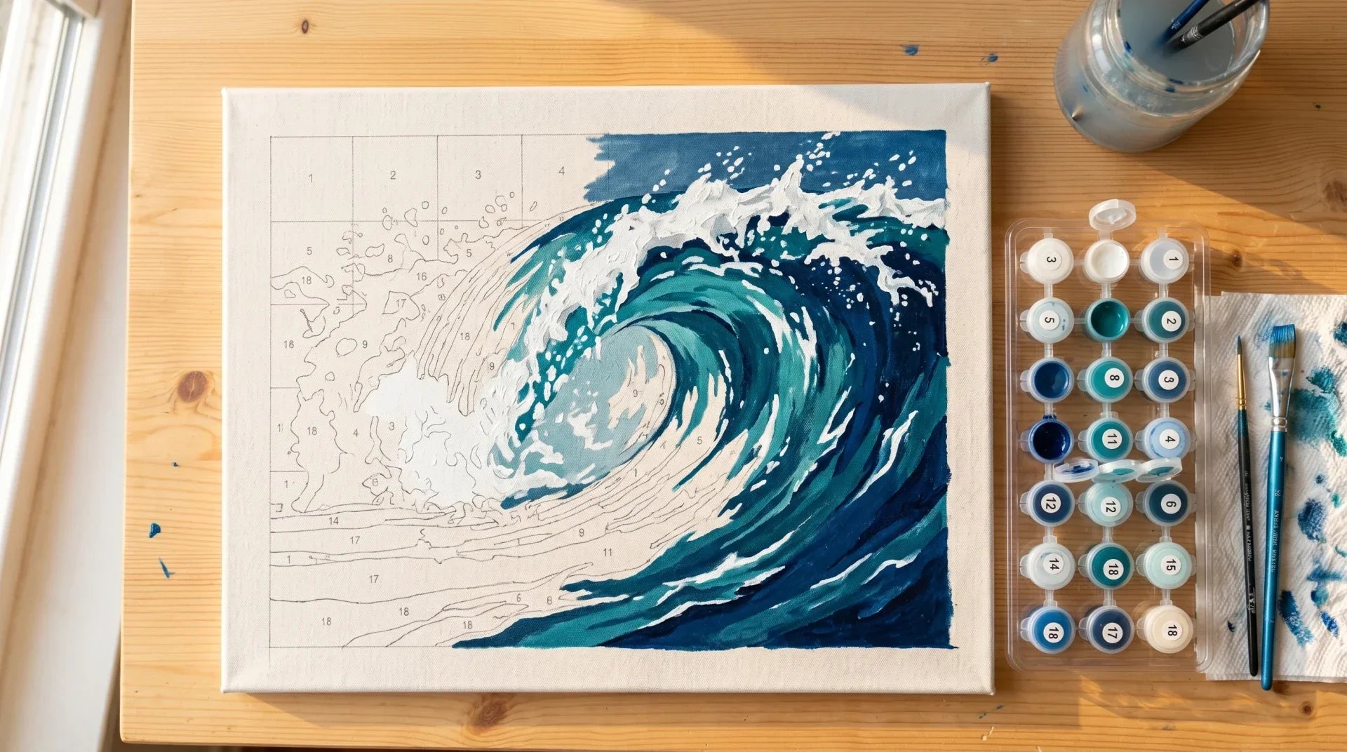
A customer named Lisa emailed us in March about an Ocean Wave kit. She had spent forty minutes on the foam, decided it looked like mashed potatoes, and was ready to scrap the canvas and order another. I asked her to step back from the table, stand at the kitchen doorway, take a photo, and send it to me. She did. The wave was fine. From three feet back the foam was bumpy, the wall of the wave curved correctly, the trough sat in the right place at the bottom of the canvas. From three inches away the foam looked like mashed potatoes. From across the room it looked like a wave that was about to crash.
Lisa kept painting. The canvas hangs in her dining room now.
Her email is most of what I want to tell you about painting an ocean wave. The foam is rarely the part that decides whether the painting works.
What actually carries wave recognition
If you go to YouTube and search for "how to paint an ocean wave", the top tutorials spend most of their runtime on two things: foam mechanics (thick warm white, irregular edges, wrap around the crest) and translucent-barrel technique (mix titanium white with cobalt teal and phthalo green for the section where light passes through). None of this information is wrong. It is just answering the wrong question for a beginner.
Recognition of a wave in a painting is carried by three things in roughly this order: the silhouette of the crest (the line from the trough, up the wall, to the breaking tip and back down), the angle of that crest relative to the horizon, and the position of the trough at the base. These three together form the wave's geometry. Get the geometry right and the painting reads as a wave even with crude colour choices. Get the geometry wrong and perfectly mixed translucent barrels and feathery foam will not save it.
Britannica describes a wave as a ridge or swell on the surface of a body of water, normally having a forward motion distinct from the oscillatory motion of the particles that successively compose it
, and notes that as a wave approaches the shore, the troughs tend to flatten and the crests sharpen toward a point
(Britannica, "Wave (water)"). The flattening trough and the sharpening crest are exactly the silhouette signature a viewer's eye picks up. That signature is what a paint-by-numbers canvas locks in before you ever pick up a brush.

Why the foam advice from YouTube stalls beginners
The foam-and-translucent-barrel approach is not wrong technique. It is wrong order. The tutorial assumes you can already draw the wave at the right angle, that you have judged the proportions to the canvas, that you know where the trough sits and how steep the crest is. If any of that is wobbling, the foam lesson is being applied to a foundation that is not there.
The result is the painter who watches three tutorials, applies beautiful textured impasto foam, and ends up with a canvas where the foam reads as a cloud sitting on a hill, not a wave breaking on water. The geometry underneath was wrong; the texture on top could not fix it.
The customers who finish their first wave painting are not the ones who studied foam technique. They are the ones who stayed inside the lines and trusted the silhouette the kit had already drawn for them.
The skill-isolation path
Paint-by-numbers was built in the 1950s to teach paint application by stripping out everything else. You do not draw. The wave silhouette is on the canvas. You do not pick colours. They are matched and numbered. What you actually practise is the one thing painting is mostly about: getting acrylic from a small pot onto a defined zone of canvas at the right thickness.
For waves specifically, this means the crest silhouette and the trough position and the horizon line are not your problem to solve on your first attempt. They are pre-solved. Your job is to fill in the colour, in roughly the right order, with reasonable brush technique. By the time you have painted two or three wave kits you have developed a feel for where a wave's crest should sit and what proportion the foam should be on a canvas, and you are ready to attempt one freehand.
This is the four steps before what the YouTube tutorials start with.
Where acrylic comes in, and why it forgives you
Our kits ship acrylic paint. Not oil and not watercolour. There is a reason.
The Smithsonian Museum Conservation Institute notes that acrylic paint "dries" by evaporation of solvent of water
and that acrylic emulsion films will always be soft at room temperature
(Smithsonian MCI). The fast evaporation gives you a second chance on the foam. Painted the crest too sharp? Wait twenty minutes and soften it. The soft-at-room-temperature film means new paint sits cleanly on the dried layer beneath without lifting the colour underneath.
Oil paint would have you waiting overnight for the wave's body colour to dry before the foam goes on. Watercolour is unforgiving in a different way: one wrong stroke bleeds across half the canvas. Acrylic on a paint-by-numbers wave kit is the friendliest learning surface there is, because every wave painting needs at least one revision pass on the foam and acrylic lets you have that pass in the same evening.
Eight wave kits that teach you something
The path I would walk a first-time customer through, in roughly increasing order of what each kit asks of you.
The Coastal Morning Calm is the kit I send to customers who have never painted water. The water in this one is barely moving. There is no crest to nail, no foam to handle. What you practise is colour transitions between sky, water, and shore, with one or two gentle ripples in the foreground. You finish this kit in two evenings and you have a feel for how acrylic behaves on a flat horizon.
The Path to Paradise is the second-easiest. A beach scene with shallow rolling waves at the shoreline. The wave geometry is gentle and the dominant subjects are the beach and the sky. Customers tell us this is the one they bought as a vacation memory and finished in a single weekend.
The Coastal Poppy Path is the wave-as-background kit. Red poppies along a dirt path with the ocean and a low surf behind. The waves themselves are the easiest part of the painting; the poppies and the path are where most of the time goes. If you want a kit that reads as a coastal painting without asking you to nail a crashing wave on your first try, this is it.
The Harbor of Colors introduces still water with boats. The water is reflective rather than crashing, which lets you practise reflection logic (the boat hull is the same colour family as the reflection underneath it) without the foam complications. Customers who paint this first often choose Ocean Wave Painting next.
The Ocean Wave Painting is the flagship of the path. A single crashing wave dominates the canvas. The silhouette is the painting; the foam is the seasoning. This is the kit where you actually learn what a wave painting feels like to finish. The numbered zones do the hard work; you decide pace and patience.
The Ocean Wave Portrait is the stylised cousin. The composition is more vertical, the wave more architectural. The colour palette pushes toward the deep teal end of the spectrum. Once you have finished Ocean Wave Painting, this is the next step up.
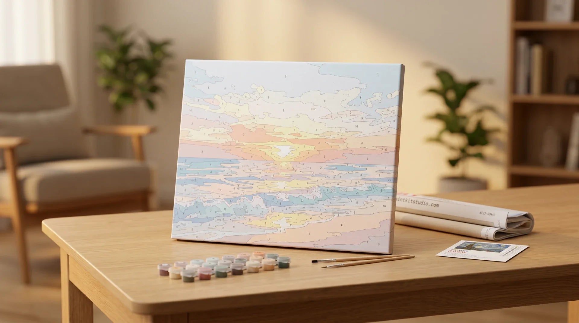
The Ocean Sunset Waves is the warm-light kit. A sunset behind a breaking wave. The challenge is the warm-tone reflection on the foam and the colour transition across the sky. This is the kit for the painter who wants to practise lighting decisions on water.
The Moonlit Ocean Serenity is the dark-palette kit. Night water, a moon path on the surface, a near-monochrome composition that asks more of your value-judgement than your colour-mixing. Save this kit for when you have finished at least one daytime wave painting; the dark palette is easier to misjudge if you have not yet built a feel for how acrylic dries lighter than wet.
And if a coastal scene from your own life is what you actually want on the wall, the custom kit turns a photograph of a specific beach or wave into a numbered canvas in about a week. We have done customers' honeymoon beaches, the cove where they got engaged, and the view from one mother's window over the Pacific. The custom kit is the version of wave painting that hangs on the wall for the rest of your life.

The mistakes that quietly kill wave paintings
Foam technique is rarely the problem on a first painting. The mistakes that actually finish a wave kit's chance of looking right are these.
The foam too white, painted wet. Acrylic looks more vivid wet than dry. A beginner paints the foam in the first session, looks at it, decides the white needs more punch, and adds more pure titanium white. By the next morning the foam has dried slightly cooler than it looked at midnight, and it reads as bone china rather than seawater. Mid-warm-white on the first pass; let it dry; only then push toward bright white at the breaking tip.
The horizon line drifted by a few degrees. The kit's number outlines define the horizon. If your sky paint creeps a millimetre below the line, the horizon shifts a degree. A degree on the horizon is what separates a calm sea from a tilted one. Slow down on the horizon line specifically; that is the line that anchors the whole composition.
The shadows skipped. Every wave has a shadow zone at the base of the crest. Beginners often skip these darker numbered patches because they think the wave should be uniformly blue. The shadow zone is what gives the wave volume. Paint it. The kit's number tells you exactly where.
The wet brush problem on translucent zones. Acrylic loaded thick onto a brush, then dragged through the translucent-barrel zone, picks up paint from the adjacent darker zone and contaminates the colour. Light load. Multiple short strokes. Let the brush dry between zones. The translucent area should look like one wash, not three.
The reflection lines forgotten. If your kit has a wave reflecting on still water in the foreground, those reflection zones are small numbered patches that beginners miss because they are squiggly and tiny. The reflections are what tell the eye there is water in front of the wave, not concrete. Paint them. The kit tells you where.
How long does a wave painting actually take?
Realistic numbers, based on customer emails about timing.
A first calm-water kit (Coastal Morning Calm, Path to Paradise) takes around eight to twelve hours total, spread across three or four evenings. Most of the time is the sky and the colour transitions, not the water.
A first crashing-wave kit (Ocean Wave Painting) is twelve to eighteen hours. The wave silhouette goes fast because the kit drew it for you. The foam is where the time disappears, in a good way; it rewards short patient passes over one long session.
A stylised or warm-light wave kit (Ocean Wave Portrait, Ocean Sunset Waves) is fifteen to twenty hours. The colour transitions are more nuanced and the painting wants a second pass on the lighting.
A dark-palette kit (Moonlit Ocean Serenity) is the wildcard. We have seen customers finish it in two weekends and we have seen others take six weeks. The variable is not the kit. It is whether the painter trusts the kit's value judgements or keeps second-guessing whether a near-black patch should really be that dark. It should.
A custom kit of your own beach or wave is the longest, usually three to four weeks of evenings, because the photograph means something and that slows the painter down on every section.
Frequently asked questions
Are waves harder to paint than landscapes?
Waves are not harder. They are just less forgiving of geometry mistakes. A tree in a landscape can be shaped imprecisely and still read as a tree. A wave whose crest sits at the wrong angle reads as something other than a wave. The kit removes the geometry question, which is why customers who could not freehand a wave can finish a kit-painted one in the same evening.
Do I need to paint the sky before the wave?
Yes. Always sky first. The horizon line is the boundary; if you paint the wave first and then try to feather sky paint up to it, the sky will pick up wave paint and the line will smudge. Sky to horizon, horizon line dry, then water. The kit's numbered zones are sequenced this way for a reason but it is worth saying out loud.
What is the best wave subject for a first painting?
Calm water, not a crashing wave. Coastal Morning Calm or Path to Paradise. The first painting's job is to build a feel for how acrylic dries and how a brush deposits paint inside a numbered zone. A crashing wave on day one piles complexity on a foundation you have not built yet.
How do I keep my whites looking like foam and not like clouds?
Two things. First, the foam needs irregular edges; clouds have smoother contours. Wrap the foam around the top of the crest in short uneven strokes, not a continuous arc. Second, foam carries a hint of the water colour beneath it. Add a touch of pale blue or sea-green to your white before painting the foam's body, and reserve pure titanium white for the brightest highlights at the breaking tip only.
Can I paint a wave from a photograph without a kit?
Eventually yes. On a first painting, no. Freehand wave painting is the highest-stakes version of the same problem; you are doing the silhouette, the colour, and the foam at once. A kit lets the silhouette and the colours be solved already, so the emotional investment in the painting can land on the part you can control. The custom kit version is the bridge most customers walk across after their first kit painting.
If our seascape collection has the wave you want, start there. If the wave that means something is from your own life, the custom kit handles the photograph. And if you want context for why waves are such a recurring subject in painting, the art-history piece on Hokusai's Great Wave traces the geometry argument back two hundred years.
Seascapes like this are a favourite in our paint by numbers for adults range, for the long, calming sessions they give you.
Browse the rest of our paint by numbers collection for more seascapes and beyond.