Article: What Color Do Red and Blue Make? A Beginner's Guide to Color Mixing
What Color Do Red and Blue Make? A Beginner's Guide to Color Mixing
By Simon I., co-founder, Paint Kit Studio. Published May 30, 2026. Last updated July 17, 2026.
Key takeaways
- Color mixing is combining two or more paints to make a new color. The whole system rests on three primaries (red, yellow, blue) and a circle called the color wheel.
- Most beginners do not have a skill problem. They have a pigment problem. "Red plus blue" only makes a clean purple when both the red and the blue you pick already lean toward purple on the wheel.
- The fix is buying two reds and two blues, a warm and a cool of each, plus a warm and a cool yellow. The setup has a name: split primary palette.
- Tints, shades, and tones cover everything else. White lightens. Black darkens. A drop of the complement mutes.
- Adding the dark color to the light color, in tiny dabs, prevents most muddy mixes by itself.
Bottom line: color mixing for beginners stops feeling impossible the moment you stop blaming the brush and start picking the right pigment.
Color mixing has a short, accurate definition. Color mixing is the practice of combining two or more paints in measured amounts to make a new color you did not have before. The system rests on three primaries (red, yellow, blue) and a circle called the color wheel that lays out how those three relate to every color you can mix from them. That is the whole theory in one paragraph.
The hard part is not the theory.
I used to assume color mixing was a skill problem for beginners. The story in my head was simple. Practice until red plus blue clicks into a clean purple. Building paint-by-numbers kits taught me something else. Every kit ships with specific pigment colors because that part is not negotiable. Pick the wrong red and the wrong blue, and the mix turns muddy no matter how carefully you brush. The fix lives in which two reds and which two blues you buy, and almost no beginner guide says it out loud. This one will.
What color do red and blue make?

Red and blue make purple. That is the short answer, and for once the short answer mostly holds: put a red and a blue together and you land somewhere in the violet family. The exact shade rides on the ratio. Lean red and it warms toward magenta and reddish-purple; lean blue and it cools toward indigo and violet; a dab of white lifts any of them to lilac. Straight from the tube in acrylic or oil, that purple shows up deep and a little muted, nothing like the electric violet glowing back at you off a screen.
So the classroom rule holds. Where it comes apart is the word "clean." The purple you actually get off your own palette depends almost entirely on which red and which blue you reached for. No art teacher ever flagged that for me until I had already mixed a whole batch of mud, and untangling it is the rest of this guide.
What is color mixing, exactly?
Two things happen at once when you mix two paints. The color shifts toward a new hue, the way yellow plus blue shifts toward green. And the mix usually gets a touch duller than either parent, because every real-world pigment reflects a little light from the other side of the wheel too. That second part is the source of most beginner panic. Knowing it goes in is enough to take the panic out.
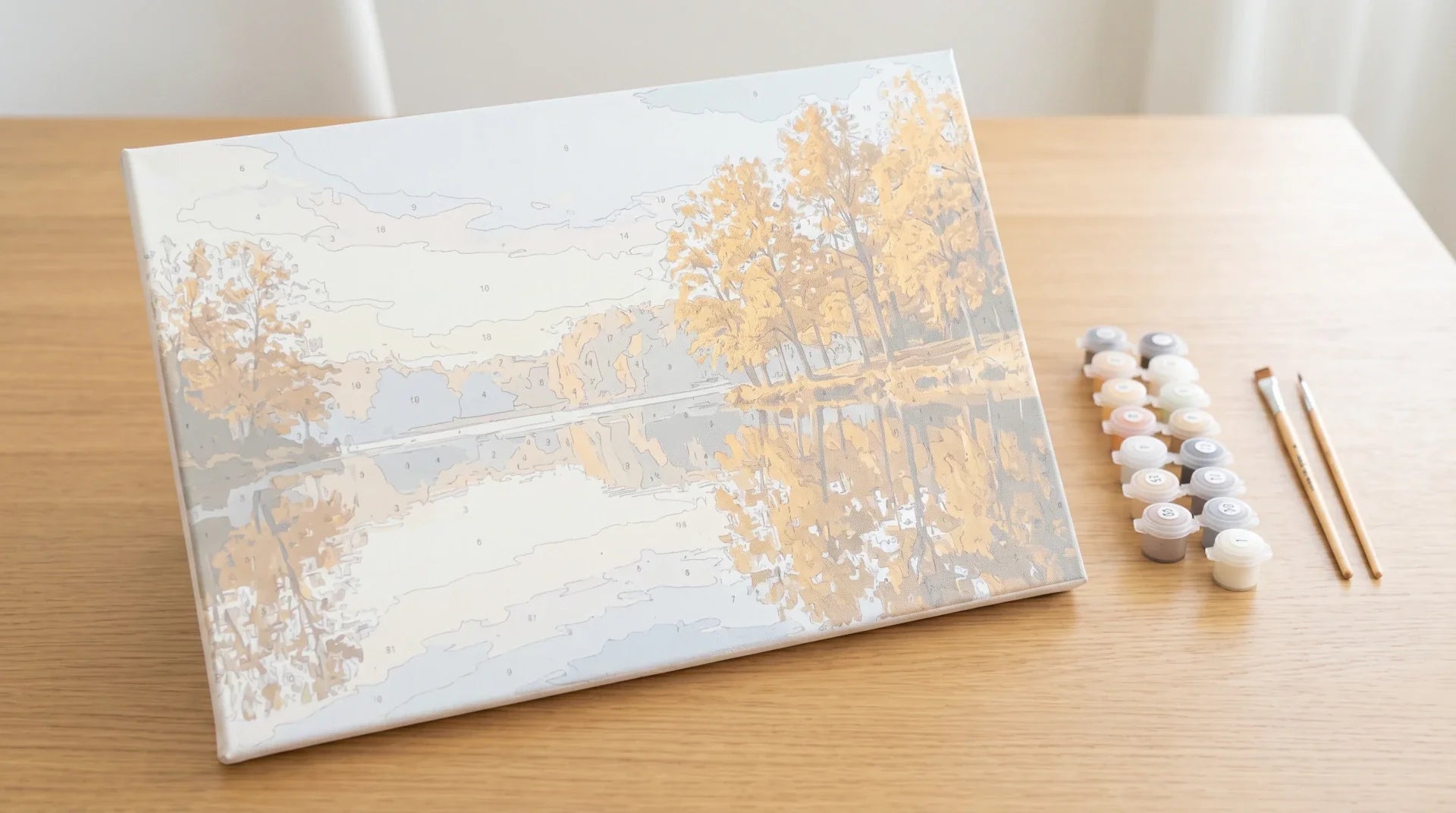
None of this is theoretical. It is also why a paint-by-numbers kit ships with pots of color already mixed for you. Someone did the matching work in advance so you do not have to learn the chemistry before painting anything at all. If "what is paint by numbers" is itself the question you walked in with, our guide to what paint by numbers is covers the format end to end.
How does the color wheel actually work?
The way I explain the wheel is, it is a circular map of how colors relate, not a recipe card to memorize. Three primaries (red, yellow, blue) sit at equal distance from each other. Mix any two primaries and you get a secondary. Red plus yellow gives orange. Yellow plus blue gives green. Blue plus red gives purple. Six tertiaries (red-orange, yellow-orange, and so on) fill the gaps between, and most are just a primary mixed with the secondary next door.
The other thing the wheel shows is opposites. As Tate puts it in its glossary entry on complementary colours (Tate, n.d.), "in colour theory complementary colours appear opposite each other on colour models such as the colour wheel" and "when placed side-by-side make each other look brighter." Side by side they sing. Mixed together, though, they cancel each other and leave a soft neutral, which is why a drop of green will deaden a red and a drop of orange will deaden a blue. Most beginners read the wheel like a recipe book. In practice it is a steering chart.
Why does "red + blue" rarely make a clean purple?

This is the question I get asked most. The textbook answer is "you should be able to mix purple from red and blue," and the textbook is right in theory and wrong in practice. The honest answer is that not all reds are equally red and not all blues are equally blue. Every pigment leans a bit toward one of its neighbors on the wheel. That lean (called its bias, or its temperature) decides whether a mix stays clean or goes muddy.
The first time I read the actual rule, in Susie Short's primer on the split primary color palette for Daniel Smith (n.d.), I felt a little cheated by every art class I had sat through. The rule is short. Pick two pigments that both lean toward the secondary you want. For a clean purple, you want a red that already leans violet, mixed with a blue that already leans violet. Pick a red or a blue that leans the other way and you are pulling a small dose of the complement into the mix, which is the exact thing that kills the saturation.
In actual tube names: for clean purple, grab Quinacridone Rose and French Ultramarine. One is cool, one is warm. The interesting bit is both of them lean toward violet anyway, so the lean survives the mix. Swap either one for a pigment that leans away from violet (Phthalo Blue Green Shade on the blue side, Pyrrol Orange on the red side) and the mix starts pulling toward yellow-green, which is the complement of purple. That is where brown-purple comes from. The frustration has dogged beginners since Newton's prism experiments in 1666.
How do you make a color lighter, darker, or more muted?

This is the part most beginner guides handle fine, so I will keep it short. Three moves cover the whole topic.
- Tint: add white to make a color lighter. A pink is a red tint. A sky blue is a blue tint. White also nudges saturation down a touch, which is why pastels read calmer than full-strength color.
- Shade: add black to make a color darker. Use it sparingly. Black is heavy, and a little of it kills a hue fast, especially on yellows.
- Tone: mute a color by adding a tiny amount of its complement (the color directly opposite on the wheel). A speck of green in a red gives a brick. A speck of orange in a blue gives a slate. This is the move that makes a painting read like a painting instead of a cartoon.
What two reds and two blues should a beginner actually buy?
Here is the practical answer almost nobody gives upfront. A beginner-friendly split primary palette is six tubes, with the named pigments most painting teachers recommend.
| Primary | Warm version | Cool version | What each mixes cleanly with |
|---|---|---|---|
| Red | Pyrrol Orange (tomato red, leans orange) | Quinacridone Rose (rose red, leans violet) | Pyrrol Orange + New Gamboge = clean orange. Quinacridone Rose + French Ultramarine = clean purple. |
| Yellow | New Gamboge (golden, leans orange) | Hansa Yellow Medium (lemon, leans green) | New Gamboge + Pyrrol Orange = clean orange. Hansa Yellow Medium + Phthalo Blue Green Shade = clean green. |
| Blue | French Ultramarine (royal, leans violet) | Phthalo Blue Green Shade (icy, leans green) | French Ultramarine + Quinacridone Rose = clean purple. Phthalo Blue Green Shade + Hansa Yellow Medium = clean green. |
Six tubes plus a tube of titanium white and you can mix a wider range of clean colors than most ten-pan boxed sets give you out of the box. The table above is one consequence of the wheel logic. Pick two pigments that both lean toward the secondary you want for clean color. Pick two that lean opposite ways on purpose when you want a muted neutral.
What are the golden rules of color mixing for beginners?
- Add dark to light, never the other way. A drop of blue will overpower a teaspoon of yellow. Start with the lighter color as your base, then nudge it darker with tiny dabs of the stronger pigment. You can always add more. You cannot take it out.
- Mix less than you think you need, and write down what you mixed. Most beginners overproduce a mid-mix on the first try, run out two minutes into the painting, and then cannot reproduce it. Mix small. Paint until you almost run out. Mix again from the same recipe.
- Use a white palette and good light. A colored palette will lie to you about the color you just mixed. North-facing window light is closest to truth. Otherwise grab a daylight-balanced bulb at around 5000K.
- Stop mixing before it looks completely uniform. Acrylic and oil both keep moving for a few seconds after you stop stirring. A mix that looks fully blended on the palette will end up flat on the canvas. A few faint streaks usually settle into a richer look once the brush hits.
- If a mix has gone muddy, add a tiny amount of a single primary, not white. White lightens. It does not save mud. Adding a touch of the dominant primary back (more of the warm red, more of the cool blue) often pulls the mix back toward vivid.
Color mixing or paint by numbers: which should a beginner start with?
This is an honest fork, not a sales pitch. Free-hand painting and paint by numbers teach overlapping but different things, and the right starting point depends on what you actually want to learn first.
Free-hand mixing teaches you the color wheel by feel. You will burn through a couple of tubes of paint making mud before any of this clicks, and that is the price of admission. The reward is real fluency. A year in, you can match almost any color you see and you understand why a green plant looks orange under a tungsten bulb.
Paint by numbers skips the mixing question entirely. Every color you need arrives premixed in a numbered pot. The format trades the color-mixing lesson for a brush-handling and patience lesson, which is a much smaller hill and produces a finished painting at the end either way. A lot of our customers (mostly adults with no formal art training) paint a few paint by numbers kits first, get comfortable with a brush, and then take the color-mixing fight on later with the confidence already in the bank. Our beginner's guide and our common mistakes guide are the two reads worth your time if you go that route. For a friendly first subject, our walkthrough on painting a cat the honest way is the easiest entry point we have. If you would rather paint a specific subject, our custom paint by numbers kit turns an uploaded photo into a numbered canvas.
Frequently asked questions
How many paints do I really need to start mixing?
Honestly, six tubes plus a tube of white. Picked as the split primary palette above, that is the practical minimum. You can drop to three (one of each primary) and still get a lot done, but you will fight muddy mixes more often. Skip black at the start. You can mix a richer near-black from a warm red and a cool blue, or from any pair of complements, and you will learn faster doing it that way.
What is the difference between RYB, RGB, and CMY?
RYB (red, yellow, blue) is the traditional painters' wheel. It describes how pigments behave when you mix paint. RGB (red, green, blue) is for light, which is why screens use it and why it is additive (more colors mix toward white). CMY (cyan, magenta, yellow) is what printers use, which is technically the more accurate subtractive set. For beginner painting, learn RYB first and ignore the other two for now.
Why does my mix look right wet and wrong dry?
Each medium does its own thing. Acrylic darkens slightly as it dries because the white binder turns clear. Watercolor gets paler because the water leaves and the pigment lays down thinner. Oil paint barely shifts at all. The fix is the same in every case. Test a swatch on a scrap of the same paper or canvas, let it dry, then adjust your mix from the dry sample, not the wet puddle on the palette.
How do I match a color I can see in a photo or in real life?
Identify three things in order. The hue (where on the wheel). The value (how light or dark on a black-to-white scale). The saturation (how vivid). Mix in that order. Pick the primary that matches the hue first, get the value right with white or a touch of complement, then nudge the saturation last. Most beginner color-matching mistakes come from chasing all three at once.
Is paint by numbers a real way to learn color, or a shortcut around it?
It is both, honestly. You will not learn to mix colors from a paint by numbers kit, because every color arrives pre-decided. You will learn how individual colors look beside each other on a real canvas, which is half of color theory in practice. Painters who arrive at free-hand mixing after a few kits tend to make the leap quicker than people who try to learn mixing in the abstract first.
Last updated July 17, 2026 by Simon I., Paint Kit Studio.